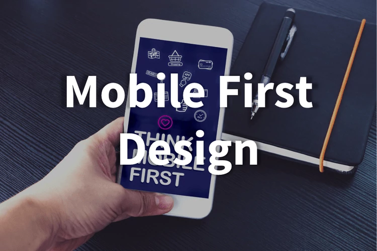
Mobile first design places prominent attention on the user experience for your mobile and tablet users, to make sure you can capitalize on all of your traffic and conversion opportunities.
The majority of users browsing the web are doing so from a mobile device. That is why search engines are putting mobile designs first on their results pages, and why we put mobile design as a top priority for our affiliate marketing platform.
A mobile-first design means new affiliates and your customers are getting the best possible experiences from any device. Many sales are started on one device and completed on another. Your customers can move seamlessly from laptop to tablet to smartphone and have the same great shopping experience.
Your affiliates can feel comfortable sharing links to their landing pages on Instagram, Facebook, or on their blog and not worry about how their replicated landing pages will look to users on multiple devices.
New affiliates can sign up easily from any device and be automatically onboarded and ready to start selling for your business immediately.